A Lesson in Color – Best Color Combinations For T-Shirts
Whether or not you are going to be designing your t-shirts yourself, buffing up your artistic theory can go a long way. Those who know how to successfully apply color theory will take designs FAR beyond the usual expectations.
Thankfully, there's no need to go back to school to major in Art! Almost anyone can get to grips with color combinations to create highly attractive designs. You'll be amazed something as simple as changing the hues or combining certain colors can transform your t-shirts.
What's more, this is an awesome way to out do your competition, and the buyers WILL notice. Now, class is in session!
Key Types of Color Combination
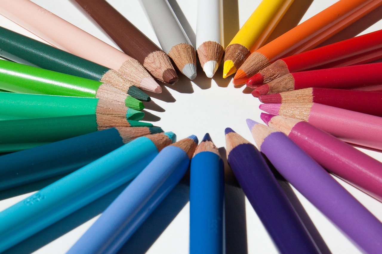
The Basic Color Wheel
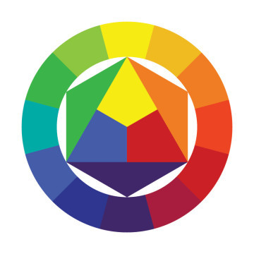
Whether you’re aware of them or not, there are several types of well-known color wheels that artists utilize. In fact, even without color training, you probably know of at least one color wheel. Red and blues, for instance, are commonly featured on a color wheel together to form different shades of purples, oranges, and other color combinations. But this same basic principle goes far behind red and blue.
Monochrome Colors
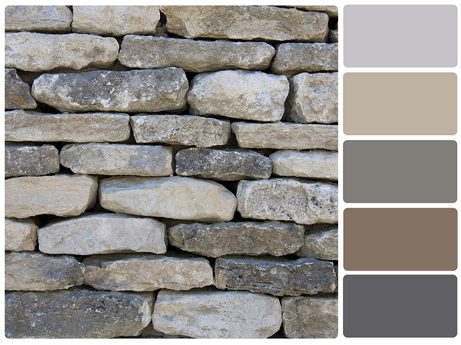
Monochromatic colors combine different shades of white and black, as well as other dark colors. While many would see gray as a boring color, look at the difference between brighter grays and almost black darker ones. Even without bright colors, a designer can get creative with these shades.
Complimentary Colors
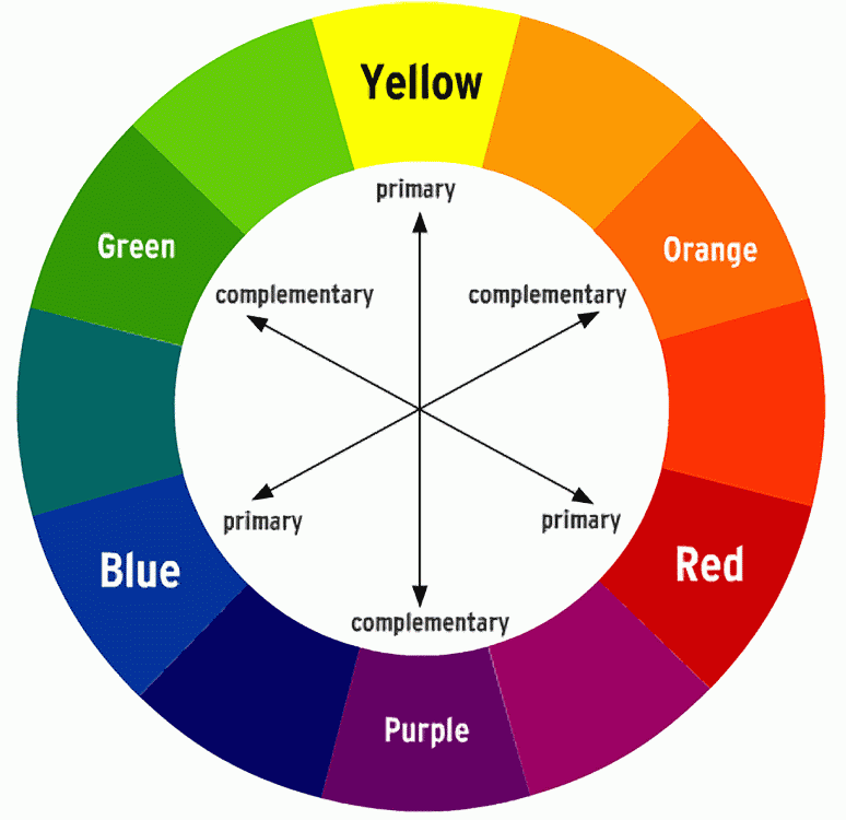
They say that opposites attract, and nowhere is that more obvious than with complimentary colors. Experiment by using clashing colors, it will become obvious which colors can’t play nice, and which ones do. Find two primary colors you like and match them together with different shades.
Split-complimentary Colors
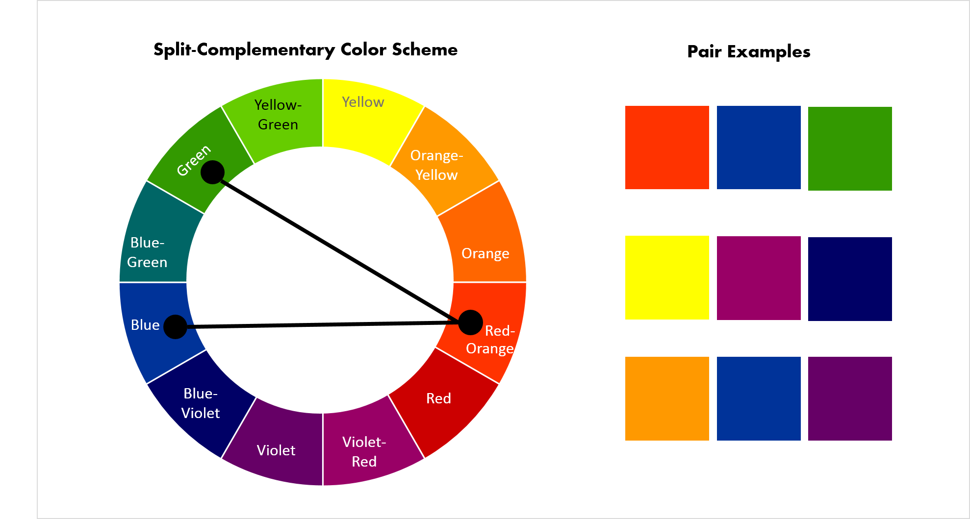
By focusing on one specific hue of color and utilizing the colors on either side of it, it can create a palette that’s safer and more user-friendly. These colors already exist close to one another, eliminating most of the clashing characteristics of complimentary wheels. Because they are neighbors, these color wheels typically take the shape of a triangle or pyramid.
Double Complementary Colors
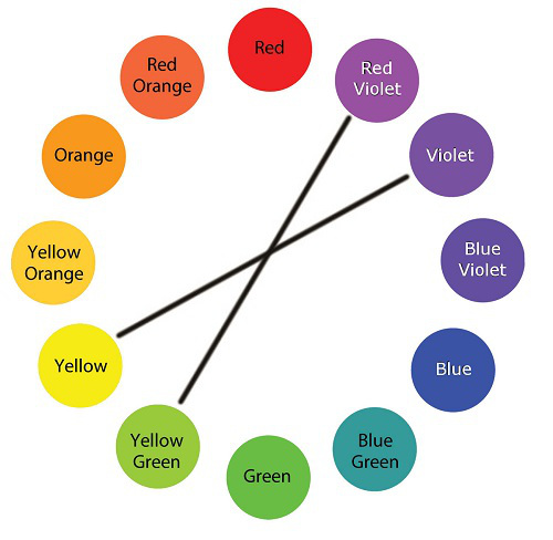
If you’re looking to double down on your color choices, then how about double complementary colors? This takes the form of a rectangle, and uses two different hues instead of one. This leads to even more choices, as well as helps see how the different colors act as a whole.
Analogous Colors
When adjacent colors are needed but you don’t necessarily need more options, then analogous combinations are helpful. One core color is chosen, with the other being adjacent to it. While this may be similar to monochromatic color wheels, but these types go beyond light and dark or black and white.
Triad Colors
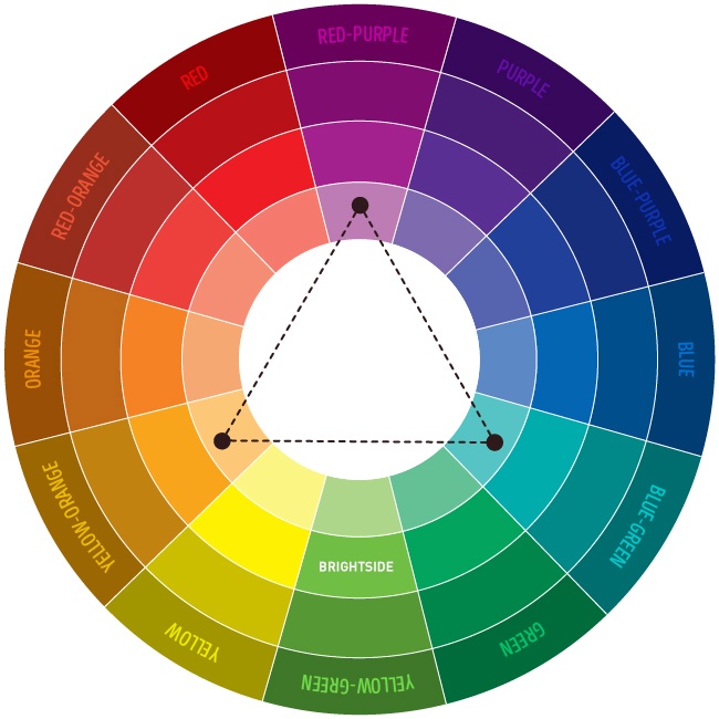
When the attitude is the more the merrier, consider using a triad color wheel. In this case, three primary hues are used, giving far more combinations to experiment with.
Combining Colors Effectively
The good news is that if you wind up going too avant-garde it isn’t the end of the world. In fact, some people deliberately utilize colors that don’t work together to intentionally so that they invoke feels of unrest, or to be provocative.
One the other hand, even the most intentional use (or abuse) of colors can fall flat. If people can’t stomach the way some colors come together, they probably aren’t going to pay to have them on their person. There’s always a fine line between making a statement and not making the sort of sales that you would need. But follow these best practices and you won't go far wrong!
1. Have One Color Shine Through
Although finding the craziest colors possible makes for a fun afternoon art project, it doesn’t help when designing a profitable shirt. No matter how creative you plan on going, focusing on one core color to work around. In this way, your colors can show support towards one another, and at least some form of cohesion can come through. This is simpler than trying to develop an entire palette, saving you time in the process.
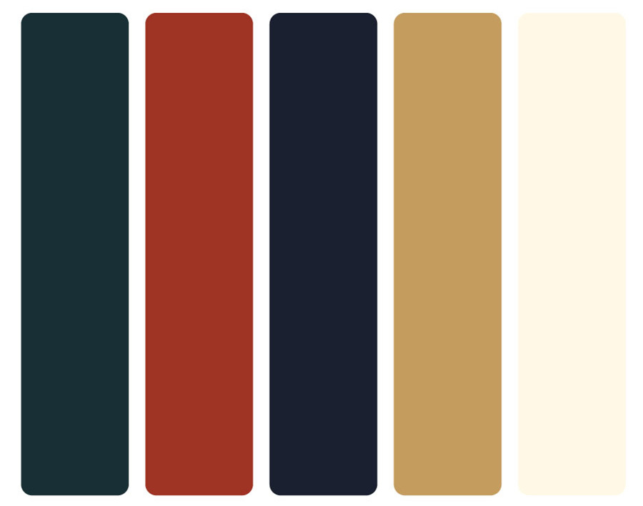
2. Stick With Four Colors
Other designers try to add as many colors as possible. However, more isn’t always best. Some shoppers simply don’t like seeing that many colors at once, while others are concerned about the ease of washing it later on. No matter what the reason, it’s a good idea to limit your selection to fewer than about four different colors. Utilizing white and black is also an option, as some don’t consider them colors so much as an abundance of or absence of color. This allows up to six different hues to mix and match, giving plenty of combinations that are printing-friendly.
3. Leverage Online Palette Tools
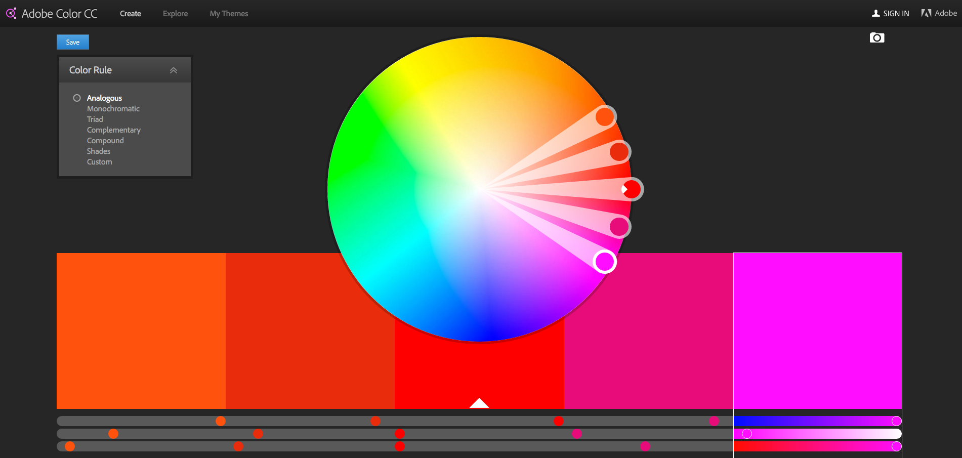
Sometimes, time is a factor when it comes developing a color palette, and that is time better spent on the business matters that make money. One way to do this is to utilize online tools which can speed up the process. Some tools, such as Adobe Color CC not only helps make a color palette but also includes other composition matches, as well as those created by others in the easy-to-use library.
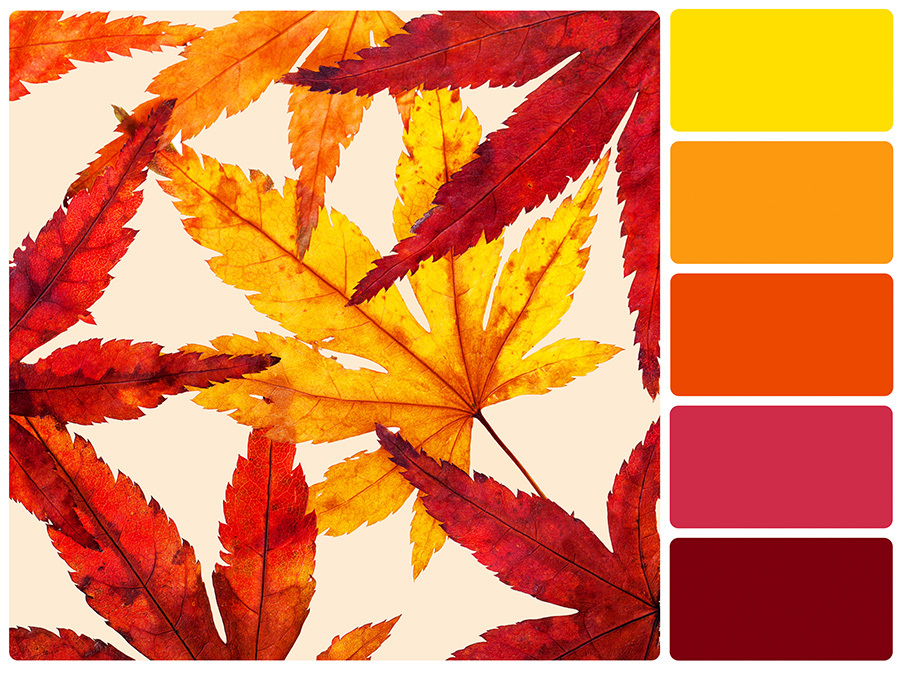
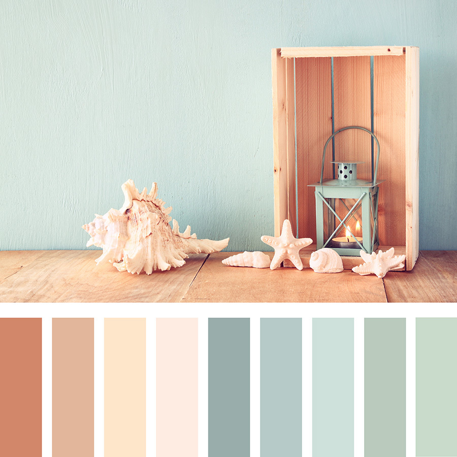
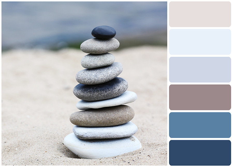
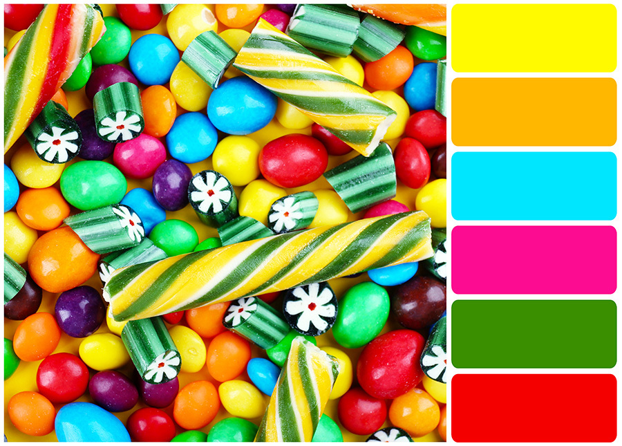
4. Draw Inspiration From Photographs
Other tools can utilize photographs to craft a color palette for you, enabling you to find cohesive groups of colors that work well together. This is perfect for trying to tap into a certain emotion or childhood memory. Most tools also allow for a user to do this manually, allowing only certain colors from the image to be used.
Colors and Styles
Once you’ve mastered a few different color palettes, it’s easy to start developing certain color styles. Doing this opens many doors, allowing you dive further into colors and seeing how different themes come about. The same process is at play here, by beginning with a base color and seeing how they invoke certain feelings or images.
This is especially useful when developing costumes; for instance, to invoke a more vintage style, more pastel-based colors are used and given little to no saturation, giving it a softer look and feel.
To go for a more timeless style, neutral monochromatic colors like whites, blacks, and beiges can create a sense of a sepia town. Darker earth-based tones may also work, although it runs the risk of looking like camouflage.
If you like a Victorian-style but want something a little more modern and whimsical, going the Steampunk route is a great choice. This style uses metallic colors, specifically coppers, and balances it with deeper hues such as darker reds, blues, and yellows. It should be noted, however, that colors achieving a Steampunk motif are never brighter than the metals used, moving them to the background.
If you’re working with a more fantastical palette, like trying to work with a comic book or superheroes as inspiration, anything can look like a superhero costume as long as it’s bold. For instance, many superheroes in comic books have costumes that use bright reds, blues, and yellows, while darker colors like black are used as outlines and for contrasts. In this way, even if you don’t have a particular hero in mind, you can still play to the theme.
Finally, the last of the more popular themes regarding an older palette is the university look. This doesn’t mean airbrushed shirts for your favorite football team, but rather, with more subdued hues of darker colors, like gold and crimson, they can look like an official school shirt. And once you find fonts and typefaces that look like the ones a school would use, you’re in business.