T-Shirt Design Master Class – Optimizing for Direct-to-Garment Printing
As simple, and unglamorous as this seems, neglecting the printing process could undermine even the most outstanding of t-shirt brands. The quality of your t-shirt prints may not be so apparent at first glance or while shopping online, but the last thing you want is dissatisfied customers. Not only will you lose potential return customers, they may express their disappointment publically rather than sing your praises.
Many of us rely on our fulfillment services to print our t-shirts on our behalf. But it's still up to you to make sure they are using quality printing equipment, processes and that your designs are optimized to suit. Get this right and every one of your t-shirts will be of highly commendable standard.
Currently, the most common method of printing of quality printing is direct-to-garment. Whether you are putting on you graphic design hat or outsourcing this task, you'll still benefit greatly this insight into the DTG printing process. To get the most of this highly-efficient printing method, you'll need to know these hard and fast rules.
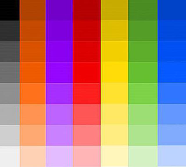
Sticking To the Basics – RGB Printing
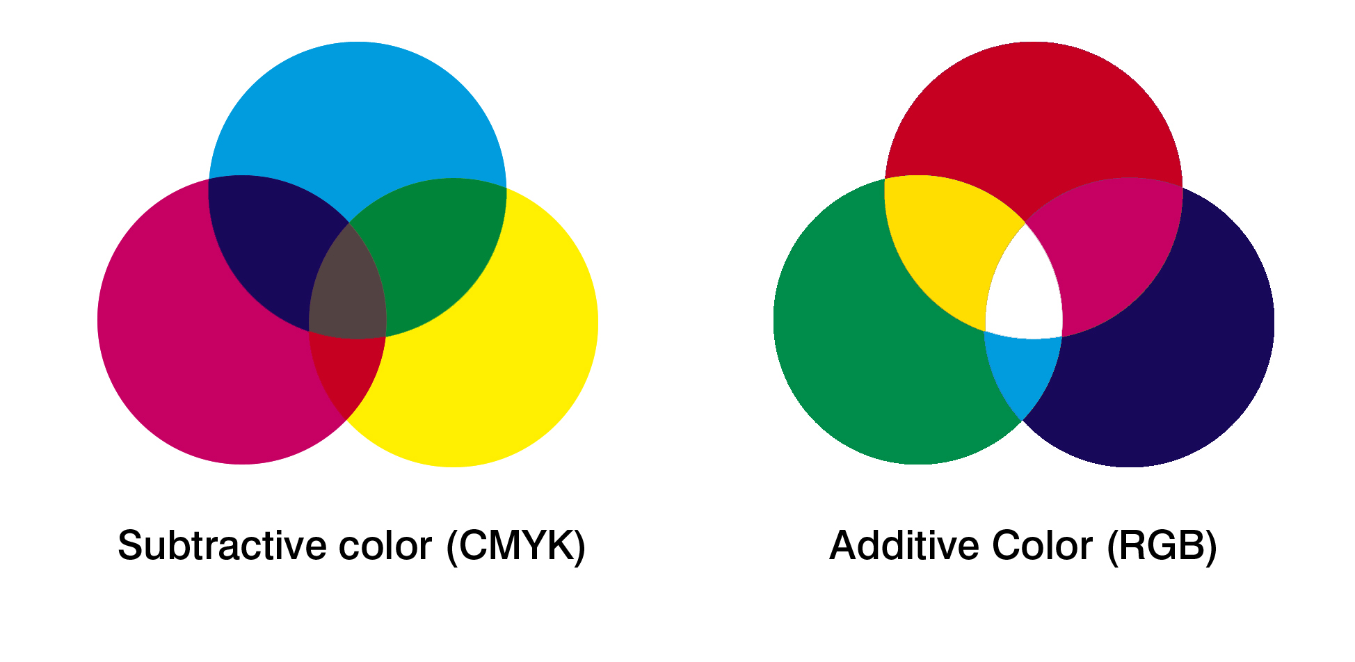
One of the easiest ways tee shirt designers can optimize their designs for printing is working in RGB (Red, Blue, Green). While the DTG printers will actually print in CMYK (Cyan, Magenta,Yellow and Black), sticking with RGB color schemes can produce beautifully clear, crisp colour patterns and prints.
For the best results, set up your t-shirt design software for RGB. By developing a design primarily using RGB colors, you can prevent faded, dulled or muted colors appearing during the printing process. Even though a simple RGB color design may appear to be a smaller file size than more vast color schemes, it will often come out far bolder and brighter!
Getting Fancy – Transparent and White Ink Printing
Certain DTG printers have the ability to print in white ink. Thus allows you to use transparency to create more interesting designs. First off, you'll need to start off by creating a transparent background for your image. One advantage of this is that it creates an image with a much smaller file size than one with a solid background. This is achieved by creating a backdrop that doesn’t actually contain any pixels; instead, it creates a white backdrop instead. However, you won’t need to do this if you are using a photograph or a design that uses a large rectangular shape.
For the best quality and resolution, save your transparent background as either a PNG or as a TIF file. They both produce similar end results; the only difference is printing scheme methods. Both PNG and TIF files will remove pixels from the transparent image, but PNG is used when printing in RGB. If you are going to be printing in CMYK, you will need to export your file as a TIF.
Getting Nitty Gritty With Resolutions
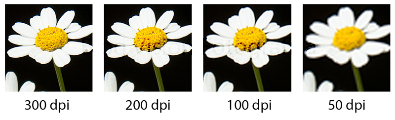
Whenever you are having a new t-shirt design created, it's essential to achieve the highest resolution possible without disfiguring the image. Each print head will have a different resolution, so you need to know how many nozzles your printer is going to need per channel for each linear inch your design needs.
Most standard design printers have around 1,450 per inch and around eight channels total. With eight channels, four are typically designated for CMYK printing and four are for white ink only. By using a 1” print head, you will have approximately 180 nozzles per linear inch per channel.
Some tee shirt designers may brag about ridiculously high resolutions. But to be perfectly honest, anything about 180 dpi is usually overkill. Anything higher than 180 is unlikely to produce any noticeable advantages after printing; however, anything under 180 will be quite noticeable.
Of course, the primary factor in choosing a printing resolution really depends on your printer. If possible, try a few different options; you may be able to get away with slightly lower resolution, say 150 dpi to 170 dpi. It all depends on the make and model of the printer you're using.
Be Wary of Mixing Color Tones
One of the factors many t-shirt designers struggle with is mastering color tones. Oddly enough, printing with mid-tones is actually harder to get the hang of than printing just light or dark tones. The reason for this is if you have two or more tones that are similar, the printer may fail to recognize the different colors and tones, turning your design into one big gray blob.
The best thing you can do to avoid this is to create striking mid-tones that pop. You can easily achieve this by making the lighter tones brighter and darker tones darker with your design software. This way, the mid-tones will clearly be in the middle of the two extremes.
This is especially true with designs revolving around imagery or designs including people. For instance, the printer may not be able to pick up the most subtle details of a person’s hair, instead, printing out a solid block of color.
If you're working on the designs yourself, be sure to learn how to work with duplicate layers. This way, you can easily see the differences in color tones, see what works and easily remove layers that won’t print well.
Balancing Out Tones Using Photoshop
Creating different tones in your design actually isn’t as complicated as you may originally think. Most graphic designers who work with different tones use Photoshop, but there are many other pieces of software this can be applied to.
Head to your “Layers” tab and create a duplicate layer. This will allow you to make and see tone changes easier. Best of all, you should be able to hide the original layer, usually with an “eye” button, to keep yourself from becoming confused. Now with whatever changes are made, you can easily delete them and return to the original layer.
In order to tweak the lighter, darker, and mid-tones, you’ll need to use the “Level” tool. This can be found under the “Adjustments” drop down in the Image tab from the main menu bar. You should see a series of sliders which allows you to adjust several different tones. With Photoshop, you’ll see the adjustments happen in real time which really helps take out the guesswork.
This is useful when working with designs that have several different color tones, but the design is unbalanced between the different tones. Once the shades begin to pop, the brighter ones becoming brighter and darker turn to darker, you can begin playing with the mid-tones. Start by getting the colors to appear at their best, and then adjust the tones around it until they seem the most pleasing.
Once you find a series of levels that look the best, you can begin comparing the experimental duplicate layer with the original. By slowly applying changes to the original, you can fine-tune your design to make it look the best possible.
Crisp Up Your Designs With the Sharpen Tool
Adjusting your design tones isn’t the only factor that will affect your print quality. To make your designs as clear and crisp as possible, you should also adjust the sharpness levels of your image. Sometimes, adjusting an image’s sharpness won’t have any noticeable changes; however, with certain images it can make a world of difference.
Sharpness varies from picture to picture, and between the original image and the printed version. On screen, your image may actually appear too sharp, but then it looks great once it prints out on the shirt. However, that doesn’t mean the goal should be to go nuts making the sharpest possible image.
Begin with the “Filter” tab under your software’s main menu, then choose “Sharpen”. Use the “Unsharp Mask” tool; this will allow you to adjust the image’s sharpness by different percentages. However, you don’t want to go beyond 100% sharpness as it could distort the printed image. As far as the radiuses of the pixels are concerned, most designers keep it set at “2” or less.
This is another point to consider is that this can be adjusted in separate layers. If you have the ability to do so, you might consider testing out different levels of sharpness.
Achieve Perfection Using Color Enhancement
The final thing you can do to set your printed design apart from the rest is enhancing your design’s colors. By adjusting these levels for different colors, you can make your design appear more striking than by simply adjusting tones and sharpness.
Again, start at the main menu bar, but this time, choose the “Images” tab. Choose “Adjustments”, and you will be faced with several different options, including changing the image’s vibrancy, color balance, hue and saturation, as well as the image’s curves.
You can also enhance the image to make the foreground of your design stand out the most against the backdrop. To do this, head back to the menu bar and choose the “Selective Colors” options. Under the “Colors” drop-down option, you will be able to increase the different levels of cyan and yellow. By adjusting these colors, you are making adjustments to the green colors of your image. You can also select all colors except for green, which will allow you to really make the green colors stand out. The easiest way to do this is by choosing the magenta slider and setting it to “0”. This will quickly and easily bring out your design’s green colors.
By using these tips and techniques, or by sharing this article with your t-shirt designer, you can take your designs from dull and plain to sharp and professional. Just remember, no two designs will require identical settings. It's important to understand how to make these necessary adjustments, either by experimenting yourself or hiring an experienced professional.
While this may seem tedious or over-the-top, this is what separates the best from the rest! If you're outsourcing the design work, there's definitely a strong case for finding a professional graphic designer over a quick Fiverr gig. This could be the difference between lackluster and popping designs that get your customers raving about your brand!